
Home Inventory App
Complete end-to-end design, test, and launch of a novel customer-facing inventory app

Role
Product Designer & CoFounder
Team Size
2
Duration
8 months
Tools
Figma
In 2024, I was approached by a full stack developer with a novel idea. He wanted to help businesses that carry a lot of physical items, like pawn shops, categorize and inventory their items in an easier way. While I was intrigued by the idea, I thought we could start smaller and try to prove the concept with a consumer facing product. He agreed. My research therefore focused on discovering the pain points others have had with current inventory products as well as features potential users would like to see.
Background
How Might We?
Address some of the pain points users have with current inventory/cataloguing apps?
Incorporate features users feel are lacking in these other products into our product?
Maintain the strengths of these apps while also creating a differentiator that will help our product stand out?

The developer’s original backend architecture
After agreeing on the focus and scope of the project, I found three products currently on the market that were trying to accomplish similar objectives as ours, namely helping users more easily organize and locate personal items. The first two, Sortly and HomeZada, while in the same space as ours, were not specifically addressing our pain points. The last product, FindMyStuff, was much more in line with the developer’s original idea.
Competitive Analysis
Sortly

Sortly bills itself as “the best inventory software for small businesses to manage their physical inventory, including supplies, materials, tools, and equipment.” With a simple-to-use interface and quick QR and bar-code scanning features, Sortly works well as an inventory software tracker. It does not, however, specifically address our pain points because it is mostly for small business and/or commercial purposes.
-
User-Friendly Interface: Intuitive, clear, and simple to learn and use, especially on mobile devices.
Mobile Accessibility: Manage inventory from anywhere, input changes directly from the warehouse using phones.
Visual Tracking: Take pictures of items, add custom fields (like part numbers, location, price).
Barcode/QR Code Scanning: Easily create and scan labels for efficient tracking.
Cost-Effective (Initially): Often recommended as an affordable solution for small businesses.
Scalability: Can grow with a business as it adds users and products
-
Price Increases: Significant, unexpected price hikes and renewal charges have upset many long-term users.
Syncing Issues: Inconsistent syncing across devices or users reported.
Unfulfilled Promises: Integrations promised by the company haven't always materialized.
Customer Support: Some negative experiences with customer service, especially regarding billing.
Busy Interface (for some): A few users find the interface cluttered or confusing for complex needs.
HomeZada
HomeZada says it is an “all-in-one” app to manage your home and focuses on all aspects of home management such as inventory, maintenance, budgeting, and even home sales. While its inventory section allows you to take photos of your home using AI and sorts by room, it is not a specific home inventory product and does not allow for the level of detail that we are hoping to provide.
-
Comprehensive Organization: Users appreciate its ability to centralize home inventory (furniture, jewelry, tools), maintenance schedules, and project finances in one place.
Helpful Reminders: The system provides useful reminders for recurring maintenance tasks, preventing costly repairs.
Project Management: Great for tracking home improvement projects, budgets, and expenses.
User-Friendly for Some: Some find it easy to set up and use, especially with pre-populated templates for rooms and inventories.
Valuable for Real Estate: Realtors use it to create attractive listings and manage client properties.
-
Usability Issues: Data input, especially for large projects, can be cumbersome, requiring many clicks and page loads.
Bugs & Glitches: Some users report issues with functions like bank transaction transfers not working.
Billing & Refunds: A significant complaint involves automatic renewals and refusal to issue refunds.
Login Problems: Some mobile users get stuck on upgrade/login screens.
Not for All Uses: Some found it useless for specific financial tracking, preferring other software like Quicken.
Excel (Indirect)
In my research I discovered that many people simply use a spreadsheet like Microsoft Excel to catalog personal items. While this is certainly cost-effective and has a smaller learning curve, Excel lack of data checking, lack of automation like bar-code scanning, and overall limited functionality and specificity for home inventory organizing makes it an inadequate long term solution.
-
Cost-Effective: Often already owned, making it cheap for most individuals
Familiarity: Most users understand Excel, lowering the learning curve.
Customizable: Easy to create unique formats, formulas, and pivot tables for specific needs.
Data Analysis: Good for basic calculations, charting, and summarizing data.
Accessibility: Easily shareable for basic collaboration (though with limitations).
-
Human Error: Manual data entry leads to frequent mistakes and inaccuracies.
No Real-Time Tracking: Data is only updated when someone manually enters it, causing discrepancies.
Limited Scalability: Becomes slow, complex, and unwieldy
Poor Collaboration: Difficult for multiple users to work on simultaneously, leading to version control issues.
Lack of Automation: No built-in barcode scanning or automatic integrations with other systems.
Security Risks: Prone to data loss, corruption, or unauthorized access without robust controls.
Limited Functionality: Lacks advanced features like automated reordering, transaction history, or deep business intelligence.
Takeaways
Researching competitors in the space helped me find possible differentiators as well as areas for improvement. While each company had unique strengths and weaknesses, I recognized some recurring “weaknesses”. These were:
Rampant Software Bugs
Lack of Customization Options
Unintuitive Design
Going forward, we decided to focus on these three areas for improvement in our product while also incorporating some successful elements from each.
User Personas
Brenda and Tony, some of our targeted users, lead entirely different lives and therefore have entirely different uses for the product. By differentiating them in this way, we are showing the product’s broad appeal.
Task Flows
In order to show proof of concept and to keep the testing as simple as possible, we chose four of the most basic flows, which were:
Introductory Tutorial
Adding a Single Item
Adding Multiple Items
Adding a Space
Tutorial
Add A Single Item
Add Multiple Items
Add New Space
Wireframes
For the mid-fi wireframes, we kept the focus on streamlined functionality while also adding some fun, light-hearted elements like a tutorial mascot and large photos. The tutorial keeps users engaged by explaining the steps in simple terms and using encouraging language to cheer on the user’s progress. Once they’ve set up their account and gone through the tutorial, the user will prompted through basic flows such as adding their first item, adding multiple items, and adding a space.
click any screen to enlarge
Simple, straightforward tutorial
click any screen to enlarge
Quick, intuitive way to add new items
click any screen to enlarge
Efficient way to add multiple items
click any screen to enlarge
Fast way to add a new space
With the user interviews and mid-fi wireframes in mind, I created components emphasized speed and maximum usability. To increase accessibility and ease of use, I chose colors that would stand out on both default and dark modes as well as a sans serif font (Arial). The logo sublty incorporates a “diving rod”, which alludes to the product helping the user find their desired items.
Finally, we settled on the name “Find My Stuff” because of its simplicity and descriptiveness. We did not yet know that there was a very similar product with the same exact name!
Design System
“OH NO! This is the same product with the EXACT SAME NAME!” - Me
As we progressed with the app, I decided to do a fuller search of similar products. Part of our go-to-market strategy involved getting naming and trademark rights for Find My Stuff. While I had initially Googled “home inventory apps” during my competitive analysis, I did not search for similarly NAMED products with intellectual property rights in mind. What I found changed everything…..
A product doing almost the exact same thing as ours, named FindMyStuff.
How did I not see it before?! Probably because I was not searching by our name initially, I was just searching for similar products. While the name was one thing, the similarities did not stop there. FindMyStuff was accomplishing a lot of what we set out to do (a quick, streamlined way to organize home items) and in a lot of the same ways we had concepted (organize by room, customization).
Nevertheless, while FindMyStuff had strengths such as ease of use and hierarchical organization, we found areas for improvement with its software bugs, rudimentary design, and lack of customization options. So we decided to continue with our product and focus on differentiating it as much as we could.

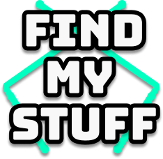
FindMyStuff (competitor) logo
I prototyped the flows and below I have shown an additional flow “Add A Location.” We tested the functionality internally until each process was virtually seamless. While the developer worked on the software bugs present in other products, I focused on customization (different ways to add items), and a more intuitive, streamlined design.
Prototype
Sign Up/Tutorial
User navigates to the sign up page and is led through a simple and fun step-by-step tutorial about the basic functions of adding their first location, space, and item
Add an Item
User locates “Add Item” on the homescreen nav bar and is given the option to add a single item or multiple items at once
Add a Space
User scrolls to the plus sign at the end of any space carousel and is able to name the space and add a photo
Add a Location
User taps on their profile photo and is able to add a new location and create a custom name or select a commonly used one
Setbacks and Final Thoughts
After further researching the most similar competitor, FindMyStuff, the developer and I reached an impasse. While our product had unique components and important differentiators as far as design and functionality, in fundamental ways the product was just too similar to FindMyStuff. Even the name we had settled on, Find My Stuff, was exactly the same! And so we decided we had to pivot.
But pivot to what?
We discussed pursuing the original idea of targeting small businesses like pawn shops, but the time commitment and ground work that that would take (approaching physical stores one-by-one) was not feasible for either of us. In the end, we decided to sunset the project and focus on other products instead.
While the product did not ultimately launch, creating and designing a product from scratch and working this closely with a developer as a cofounder taught me invaluable lessons about the challenges and rewards of collaboration and the necessity of resilience when launching a new product.
The developer and I have resolved to work together again in the future and I have promised him that once we have settled on a name, I will make sure it is not already taken!
So What Did We Learn?
CRAIGSLIST RESPONSIVE
WEBSITE REDESIGN